Create a Delta Dashboard
Use a Delta Dashboard to compare key organizational metrics before and after changes in your scenario. Delta Dashboards help you evaluate structural and financial impacts, validate decisions, and align your design with business goals.
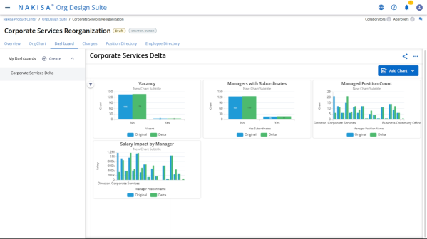
Open the Dashboard Tab
- From your scenario, navigate to the Dashboard tab.
- Click Create Dashboard.
Enter Dashboard Details
In the Create Dashboard dialog:
- Name: Enter a meaningful title for your dashboard (e.g., Post-Reorg Impact).
- Type: Select the dashboard type.
Note: For delta comparisons, choose Delta Dashboard.
- Click Next.
Select Datasets
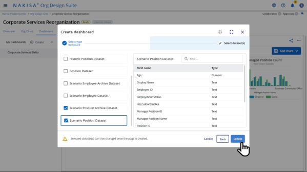
You must select at least two datasets for a delta comparison.
- Choose your datasets:
- Scenario Position Archive — represents the original state when the scenario was created.
- Scenario Position or Scenario Employee — reflects the current state with your changes.
- You can select up to three datasets.
- Click Create.
Add a Chart
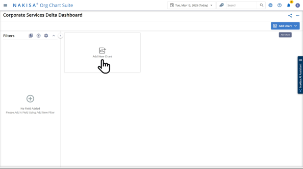
- Click Add Chart.
- Choose a Chart Type:
- Bar Chart
- Line Chart
Note: Only these chart types are supported in Delta Dashboards.
- Click Next to begin customization.
Configure Chart Settings
Customize Tab:
- Scroll to Dataset Settings.
- Enable the Secondary Dataset toggle.
Data Tab:
- For Primary Dataset, select Scenario Position Archive.
- For Secondary Dataset, select Scenario Position.
- Add labels for each dataset (e.g., Before Reorg, After Reorg).
These labels will appear in the chart legend to distinguish historical and current data.
Define Chart Axes
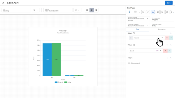
- From the dataset dropdown, choose the field you want to analyze.
Example: To track open roles, select Vacant.
- Set the X-axis and Y-axis accordingly.
- X-axis: Organizational unit, role type, or manager.
- Y-axis: Metric value (e.g., headcount, salary).
- Enter a Chart Title (e.g., Vacancy Comparison).
Customize Appearance
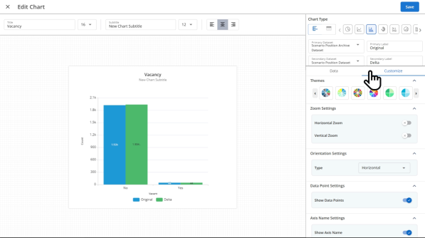
In the Customize tab, you can enhance chart readability:
- Show Data Points
- Show Axis Names
- Enable Grid Lines
- Adjust Color Palette
Click Create to finalize and add the chart to your dashboard.
Add Additional Charts
Repeat the steps above to compare other key metrics:
- Manager with Subordinates — Track the number of active managers before and after the changes.
- Span of Control by Manager — Visualize changes in management scope.
- Total Salary — Compare overall compensation impact to assess financial shifts.
Interact with the Dashboard
Click any chart to zoom in for a detailed view.
Note: Field availability is currently limited but will expand in future updates.
Best Practices
- Use consistent labels across charts for easy comparison.
- Keep axis names clear and aligned with scenario terminology.
- Combine financial and structural metrics to present a complete impact summary.
Delta Dashboards allow you to visualize and validate the full effect of your reorganization. By comparing archived and current data side by side, you gain insights that support data-driven planning and executive alignment.

|
Nakisa Workforce Planning Portfolio 2025.R2 © 2025 |
Nakisa Inc. All rights reserved worldwide. |